

Choose your country.
A new year, new colours. Even though an interior is not as influenced by the latest trends as the clothes in your wardrobe. With a lick of paint or nice accessories, you can add a breath of fresh air to your interior.

We are all aware of the effects of colour on our mood. Whether it’s a cool blue or a warm terra, it makes a big difference. Every year, various experts proclaim a certain colour as 'Colour of the Year'. Which colours are hot in 2023? And even more important, how do you use them in your interior?
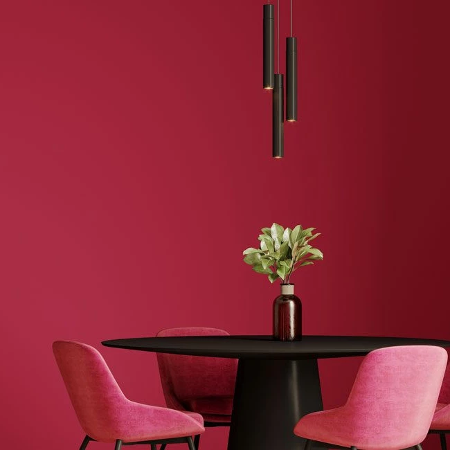
Pantone has chosen Viva Magenta (Pantone 18-750) after Very Peri in 2022. This is a hue that expresses vitality, power and strength, inspired by nature and the world around us.
“It's an unconventional colour for an unconventional time,” says Laurie Pressman, Vice President of the Pantone Colour Institute. Flirting between red, pink and purple, Viva Magenta invites us to open new doors, dive into the future and put away the bad memories of the past few years.
In an interior, it is quite an intense colour. However, with accessories in this cheerful colour you immediately bring a spring feeling to your interior
(photograph: shutterstock)
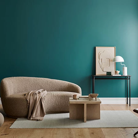
As far as Histor is concerned, we need to bring more peace and balance to our interiors with the blue-green (or is it green-blue?) Vining Ivy. The paint manufacturer mixes strong blue with refined green for a deep gemstone colour. Blue evokes tranquillity, while the emerald green tone creates a sense of balance.
This trend colour combines perfectly with neutral beige tones that are characteristic of the Japandi style, for example.
(photograph: Histor)
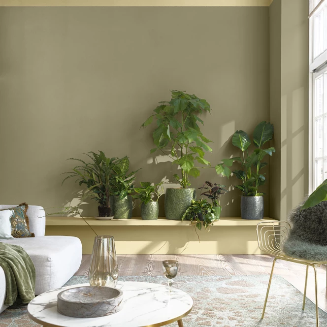
A lot calmer than Viva Magenta or Vining Ivy, but anything but dull. According to Flexa, this natural shade of yellow creates a link with nature and helps bring nature's magic into our homes.
As far as we are concerned, this colour is the most versatile of the three. It can be combined in different ways: calm and quiet with other neutral tones or as a base that allows other more pronounced colours to stand out.
(photograph: Flexa)
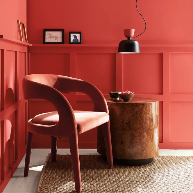
Love at first sight with this Raspberry Blush. Benjamin Moore describes this colour as a vibrant shade of coral, tinged with pink. This electric hue is the definition of colour.
Raspberry Blush represents leaving your comfort zone and daring to explore new things. It’s an absolute statement colour. Suitable for an accent wall or as an eye-catcher here and there.
(photograph: Benjamin Moore)
Photograph header: Shutterstock
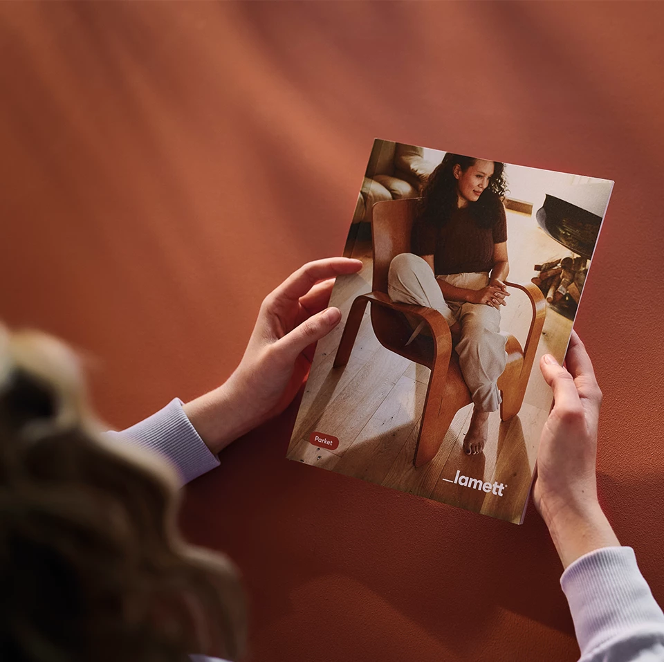
Want to browse between the different collections and photos? Download our inspiration brochure. Besides all the collections and lots of photos, you will also find all the technical details.
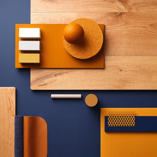
These days, people are looking at the sun more than before. They’re feeling hopeful and positive, like there’s finally some brightness coming.
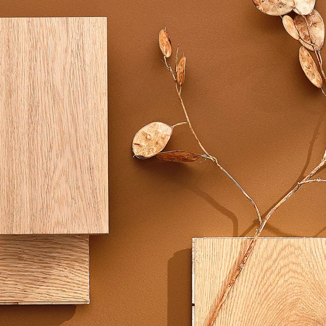
The energy crisis, the climate crisis, the corona crisis. Life nowadays seems like a succession of crises. A growing amount of people are realising that during such crises we cannot rely on our leaders.
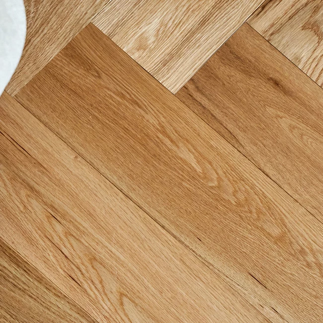
Very striking today is a particular focus on the tactility of objects. This tactility has now developed into a style of life an sich.